154. Selecting Non-Toxic Watercolor Paints
To accompany today’s video, I’ve written down my reasons, process and results for creating a healthier palette.
Let’s get something straight. I am not here to preach. I am not an expert on this topic, but I have been researching a lot. I am simply a health-conscious and nature-conscious person trying to make informed decisions.
You’d be hard-pressed to find a wide range of colors that have the vibrancy of many of the most toxic paints on the market, BUT there are some great non- or less-toxic options out there. Most of us don’t have time to harvest, grind, and make our own paints so we are at the mercy of the manufacturers (and have to trust the information they share about their paints).
Ultimately you have to decide for yourself if your choices are the “lesser of evils!” For me, it’s an ongoing learning process and I am constantly adjusting my choices to my research.
I have to admit, at first this process was really overwhelming. There are so many brands, colors, and pigments out there, and some of the information is either misleading or conflicting.
If you want to go through this process but are unsure how, you can follow this step by step process that worked for me.
Reasons to Choose Earth Friendly Paints
Our choices have a direct impact on the environment, so I’m making a conscious effort to reduce my impact.
The environmental impact of paints span from the mining, to manufacturing, distribution and disposal.
When you clean your brushes, or pour your dirty paint water down the drain, they could be entering the local waterways. Whether it’s treated or not (and how well) depends on the waste water treatment in your area, and you can do your own research on that. Even if the water is treated to remove all possible toxins, the moment you buy a paint that contains toxic material you are contributing to the industry that produces them.
If the pigments you pour down the drain contain heavy metals or other toxic materials, and end up in the waterways without being treated properly, they move up the food chain from small fish and animals to our own bodies.
So how do you begin?
The Process
Lay out all your pigments and write down each brand, the color name, and most importantly, the pigment numbers.
Pigment numbers can be found printed on the label and start with the letter P (it stands for “pigment”)
PY (pigment yellow)
PR (pigment red)
PB (pigment blue)
Etc…
Using the pigment numbers, research what each one is made of.
I highly recommend using these resources:
Make a spreadsheet of your colors that includes the information you find.
My Patreons have access to my spreadsheet.
I also wrote down the lightfast ratings and opacity levels at this stage.
Regarding lightfast ratings, there are some industry standards. The most well known industry standard rating system is called ASTM.
To quote handprint’s warning about lightfast ratings:
“Only tests actually done on watercolors can guide your pigment selections. Lightfastness ratings of oil or acrylic paints are not a reliable guide to the permanence of watercolors made with the same pigment, because pigments last longer inside the protective coatings of oil or acrylic vehicles than when left bare on paper with an irregular coat of gum arabic. Keep in mind that some watercolor paint manufacturers simply quote the lightfastness test results provided by the pigment manufacturers, who commonly test their pigments in an oil or acrylic dispersion.“
Go deeper
Do your own lightfast tests.
If possible, try to find out how particular pigments are mined and manufactured. Most of this information is proprietary, but if you are a google ninja you might be able to find out more than I did!
Eliminate undesirable paints
Remove all paints that contain toxic materials such as cadmium, cobalt, nickel, and aluminium.
Remove all paints that have a poor lightfast rating.
Remove all paints that contain multiple pigments unless you have a brilliant reason for keeping them. Paints with more than one pigment complicate mixes. Think of it this way, if you have two colors, each of which contains 3 pigments, when you mix those two colors you are essentially mixing 6 colors. If some of those pigments contain complimentary colors, as they mix they are going to turn more grey or brown. Now add to that another color or an opaque color and your chances of creating a muddy mixture increases.
Consider the transparency or opacity. Transparent pigments are easier to glaze. Opaque pigments can sometimes create muddy mixes, so do some tests. However, opaque pigments can also be useful for building rich prominent color in one area of a painting. It’s up to you!
Narrow it down
By now you probably have reduced your paint collection by a lot! Alternatively, perhaps you have been doing research about paints you don’t own yet. There are LOTS of great comparison videos that will give you a rather good view of paints, how they mix and dry. I really enjoy Dr Oto Kano and In Liquid Color on YouTube.
Time to thoroughly test out whatever paints made the first cut in order to find your perfect collection.
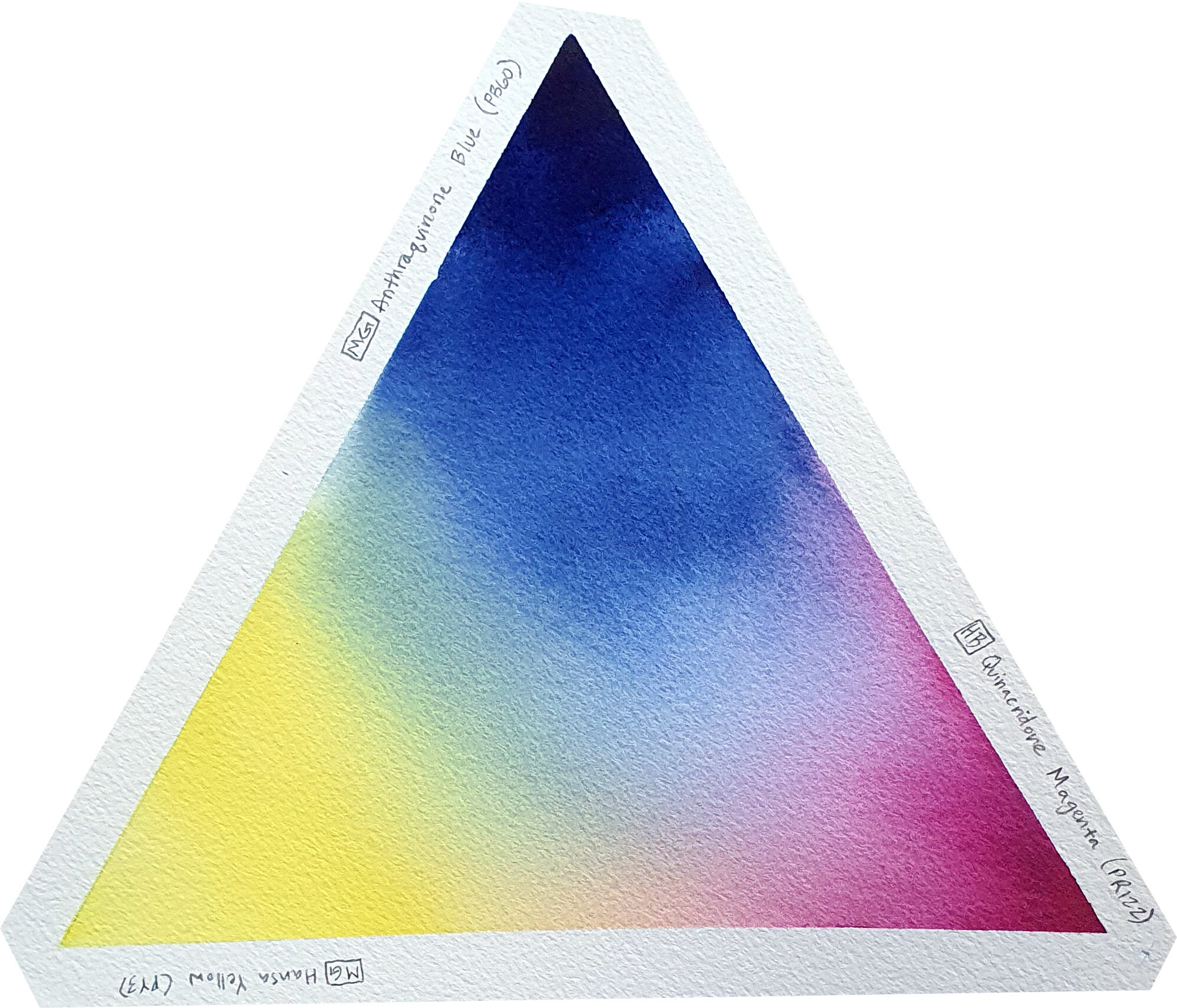
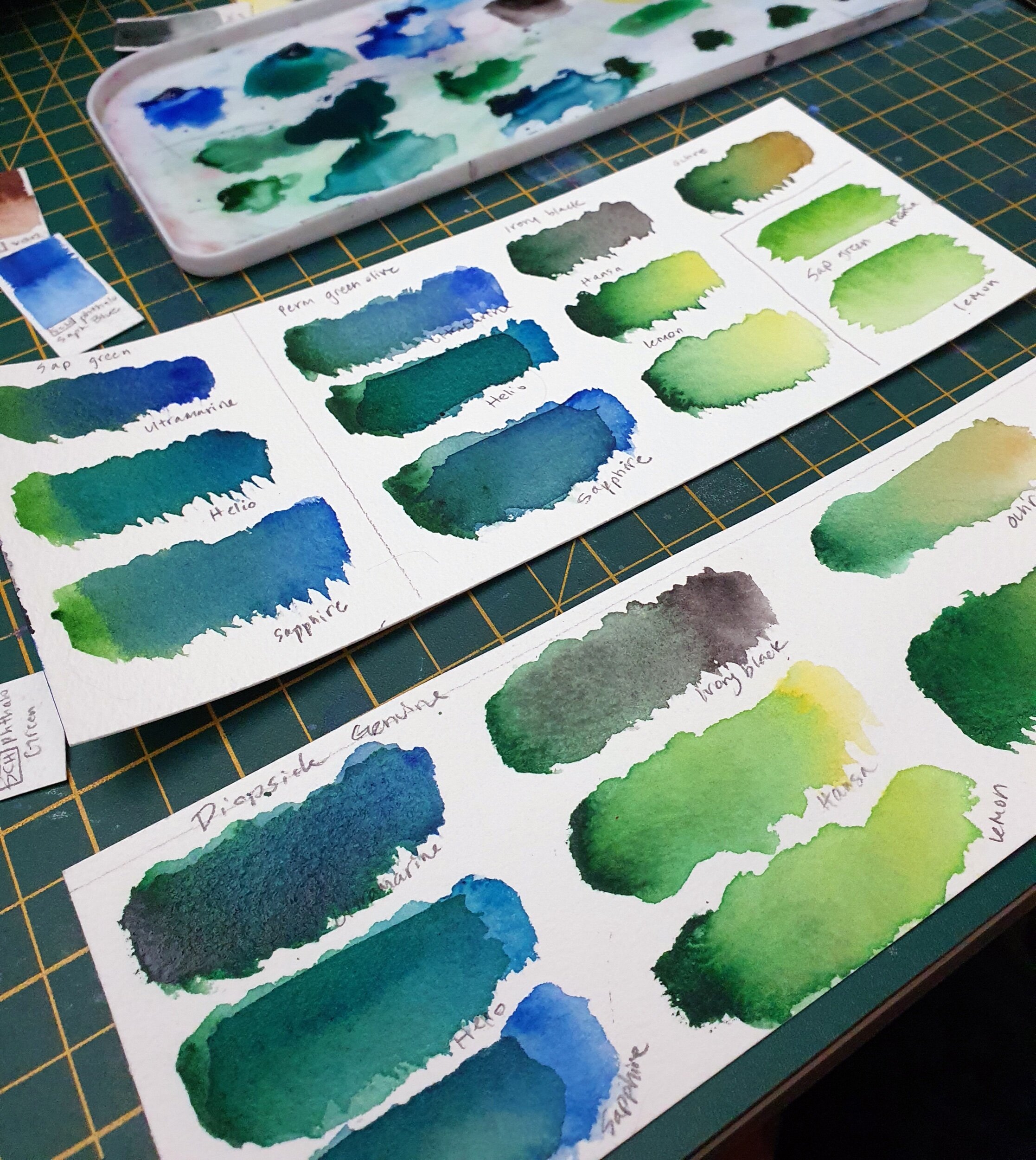
Start with making color mixing charts (whichever kind you find most useful!) Above you can see the types of charts I prefer.
Really pay attention to how each color mixes with others. Does it mix cleanly or does it turn into a dull puddle?
Do the mixes stay vibrant after they are dried? Almost all colors experience a “drying shift” - losing saturation and value as they dry. Some are more intense than others, and you’ll need to decide what works best for your artwork.
I recommend doing a few test paintings - whatever your favourite subject is…portraits, landscapes, whatever.
Results
You might come to find that some colors don’t play nicely with others, or they turn out to be rather dull or boring. Whatever the reason, don’t be afraid to cut it from your lineup. You should only have colors that you absolutely love, that excite you, and that help you create your best work.
It’s time to enjoy your new selection of colors!
My Colors
I’ve settled on the following list of colors. My palette is like a restaurant with an ever changing menu. I test out colors that combine to make delicious meals, but eventually my taste changes.
I’m very much in love with these colors and look forward to several seasons of delicious meals.
M. Graham Anthraquinone Blue (PB60)
A gorgeous deep blue similar to indigo that provides very bright, clean mixes. So far in my tests it remains vibrant and also allows very deep darks.
Schmincke Ultramarine Finest (PB29)
A bright blue that is a wonderful “base” to work with for skies, water bodies and shadows. Remains pretty vibrant as it dries and mixes beautifully with other colors. It lightens in value when dry, and I’ve noticed it’s more difficult to achieve very dark darks with this color.
Schmincke Phthalo Sapphire Blue (PB15:6)
A blue that’s extremely deep but dilutes to a very bright (almost electric) blue. This wide range of values makes this pigment really useful. It works great for oceans and waves!
Schmincke Helio Turquoise (PB16)
Not for the faint of heart…this Very electric blue is a great color for oceans, shores, and florals. It makes gorgeous browns when mixed with reds and burnt orange.
Schmincke Phthalo Green (PG7)
A staple for anyone who likes turquoise but wants to avoid cobalts. This color mixed with most blues provides gorgeous, vibrant turquoise. Also great for shadowy foliage and grasses.
Schmincke Perylene Green (PBk31)
An extremely dark, deep green. Much more neutral, and mixes beautifully with lots of colors to help neutralise them.
Daniel Smith Primatek Diospide Genuine
Similar to “Kelly Green” or a darker “May Green” this color is perfect for trees, fields of grass, or any medium green. Add a bit of warmth or cool to tint to your needs. Very granulating which makes it wonderful for landscapes.
Daniel Smith Primatek Serpentine Genuine
A bright green similar to Daniel Smith’s Green Gold but without the nickel! It isn’t quite as vibrant as green gold but can easily be warmed up with a yellow. Since this is a Primatek color, the granulation is wild, and provides a duotone effect when dry. In the highlights it’s got hints of yellowish brown. In the mass tone it’s more green. The strong visual texture makes in a wonderful choice for landscapes.
Holbein Quinacridone Magenta (PR122)
An extremely vibrant pink/magenta that is very lightfast, transparent, and mixes beautifully with everything I’ve paired with it. This color is just plain gorgeous!
Schmincke Perylene Violet (PV29)
My primary red, a deep burgundy red that creates more muted mixes (perfect for more natural landscapes compared to cadmium red)
Schmincke Potter’s Pink (PR233)
A deliciously granulating dusty pink that I mix with nearly everything that needs a bit of texture! Since it is a rather dull color on it’s own, it won’t overpower your mixes. It is perfect for sandy beaches, rocks, bark, and so many other landscape elements. I even add a bit of this to the shadows of clouds!
Schmincke English Venetian Red (PR101)
A very opaque dull reddish orange color that can easily overpower a mix, but when used properly provides a great base for browns and neutrals.
Daniel Smith Quinacridone Burnt Orange (PO48)
This is a very vibrant rusty orange that works great for a pop of color in a landscape. It’s very transparent and creates beautiful mixes, especially with anthraquinone blue for a beautiful rich brown color.
Schmincke Yellow Ochre (PY42)
A dull, opaque yellow that (I feel) is a beautiful option for more natural looking landscapes. Can easily be warmed up with a pure yellow, but I especially love mixing this color with blues to create beautiful olive greens. Because it’s opaque it can also be used for those final bits of highlight to finish a painting (almost like gouache).
M. Graham Hansa Yellow (PY3)
A pure, almost cool yellow (not as cool as lemon yellow) that mixes well with other colors. It reactivates instantly because of M. Graham’s use of honey in the binder, and a little bit of this yellow goes a LONG way.
However once this tube is empty I’ll be replacing it with Daniel Smith’s Hansa Yellow Medium because it’s more lightfast and creates cleaner mixes.
Sennelier Neutral Tint (PBk7, PB60, PR209)
My preferred choice instead of black or the classic “Paynes Grey” for a convenience grey. This color, despite being made up of three pigments, mixes will with everything, provides very interesting fine granulation, and works especially well for dramatic skies! This color can be used to instantly neutralise any other color.


